
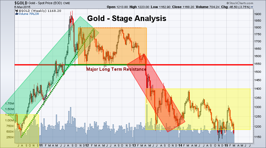
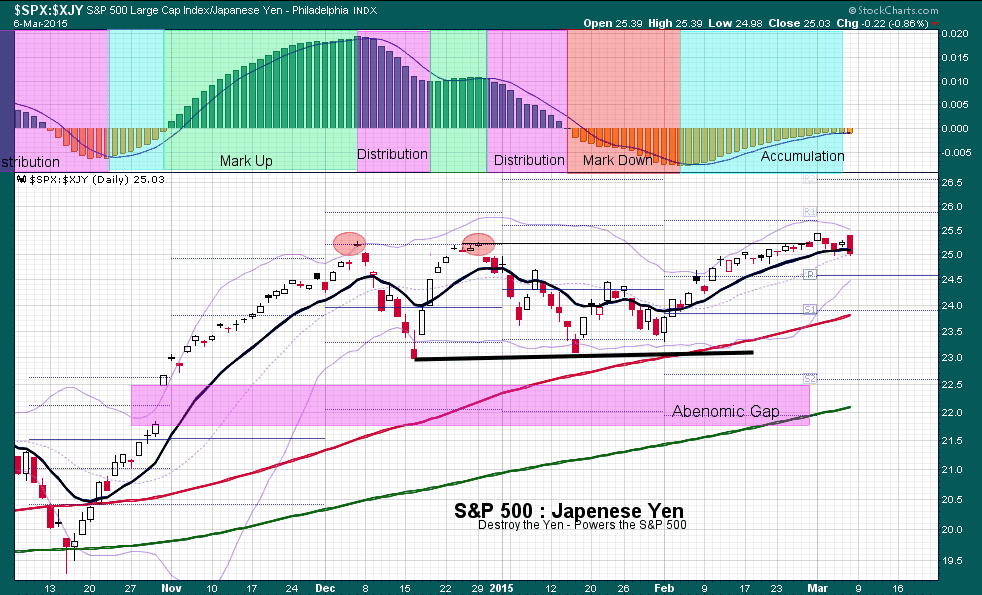
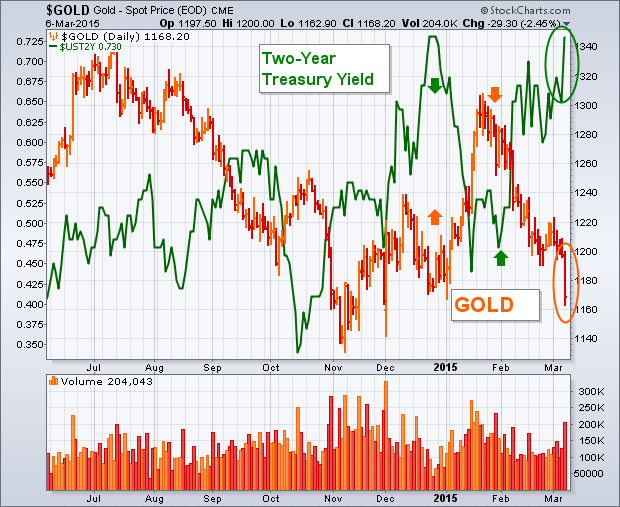
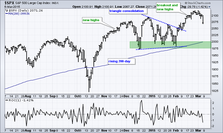
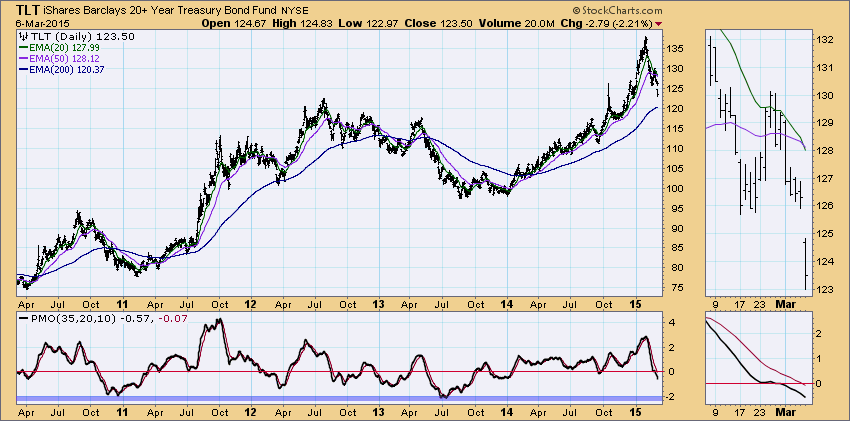
Hello Fellow ChartWatchers!
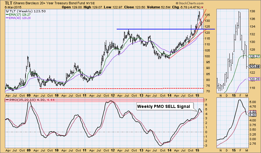
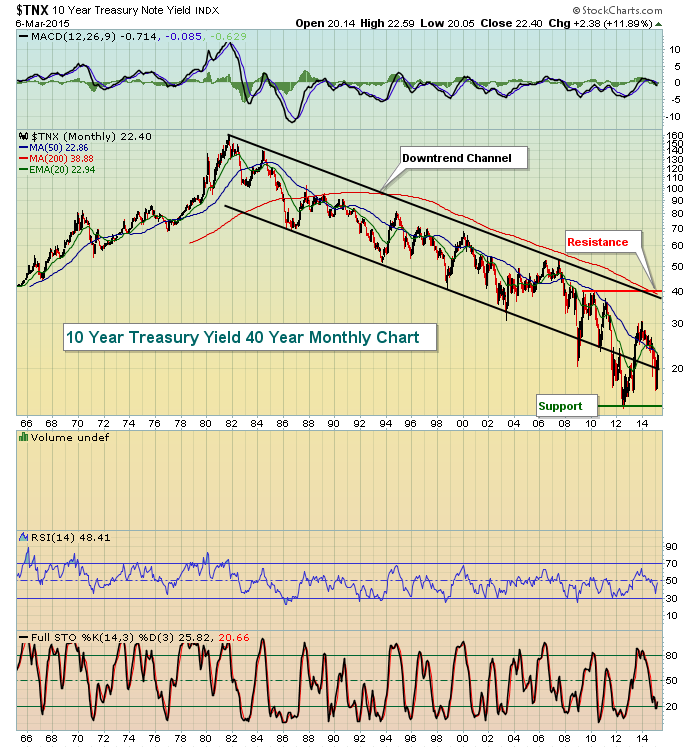
The market gave back ground this week, especially on Friday as a good Jobs report led to fears that the Federal Reserve would raise interest rates soon. It definitely seems like a turning point in the market just occurred as the Sector Rotation picture is now muddier. Compare last week's Sector Rotation PerfChart to this week's edition:
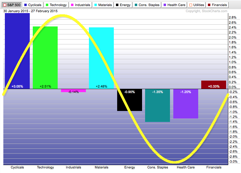
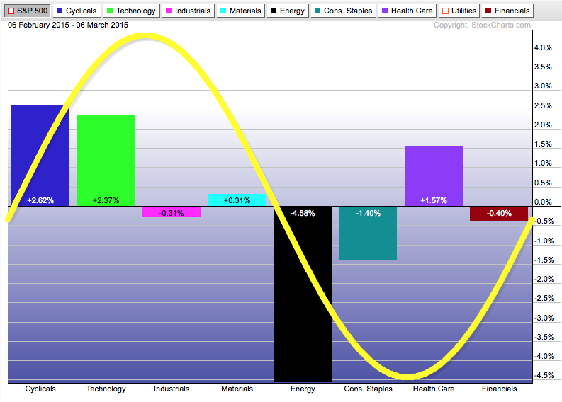
(Note: I've removed Utilities from these charts since they are very heavily skewed downward at the moment.)
In the first chart, most of the bars are positioned between the yellow cycle line and the zero line - an indication that sectors are rotating "normally" with the bullish sectors (on the left side) moving the market higher. In the second chart, things are starting to become more "up-down-up-down" meaning that there is less agreement about where things stand. Click here for more on sector rotation.
Free Market Analysis! Get your Free Market Analysis Right Here!
One of the true "hidden gems" on our website is the "Public ChartList" area. Public ChartLists are sort of like blogs for chartists. Anyone with an Extra, ExtraRT or PRO account can create a ChartList, fill it up with great charts and market commentary and share it out with the rest of the world. These shared ChartLists are free for anyone to read and many of them contain some very high-quality market analysis and trading ideas. I strongly encourage everyone to spend some time at least once-a-week visiting our Public ChartList area.
To see our Public ChartLists, use the "Public ChartLists" link located in the "Commentary" box on the right side of our homepage (or click here for now).
On the main Public ChartList page, you'll see the top 100 lists ranked by "Popularity." The lists at the top have consistently contained high-quality content that other readers have found valuable again and again. They are definitely worth a look. Here's are several somewhat randomly selected examples of what you'll find there:
(I'll leave it up to you to find the ChartLists that these charts belong to. Hint: They are somewhere in the top 20 lists.)
As you can see from these examples, there are many, many surprising charts in our Public ChartList area!
In order to help you decide which other lists might be worth a look, we've added several things you should be aware of: Badges and the Categories dropdown.
- List authors can earn badges (i.e. the little grey icons beside their name) for completing various skills requirements and training events. The more badges the better.
- List authors can also select up to three different categories for their ChartLists. You can use the "Show" dropdown at the top of the page to find lists that better meet your interests.
Finally, if you are a member of StockCharts.com, you can Vote for and/or Follow your favorite lists to reward the author for a job well done. You can vote for up to 3 different lists each day by clicking the "Vote" button in the area at the top of each individual list. As the expression goes "Vote early, vote often." List authors L-U-V your votes.
If you really like a Public ChartList and you'd like to be notified whenever it is updated, click on the list's "Follow" button. That will mark the list as a favorite of yours and send you email whenever updates are made. Following a list will also reward the list's author with additional "Popularity" points.
So, again, don't forget to visit the Public ChartList area of the website at least once-a-week and vote for your favorites. It's your "civic duty" as a ChartWatcher!
- Chip
P.S. For more on Public ChartLists including tips for Public ChartList authors, please watch the recording of this weekend's "ChartWatchers LIVE!" webinar.
 I have three objectives for this blog. First, to invite and encourage fundamental investors to embrace the value of visualized dividends which can now be plotted on a chart along with price. Secondly, to nudge all investors to consider allocating a percentage of their portfolios to dividend yielding stocks, both domestic and international. And finally, to compare three