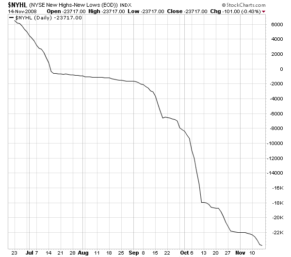
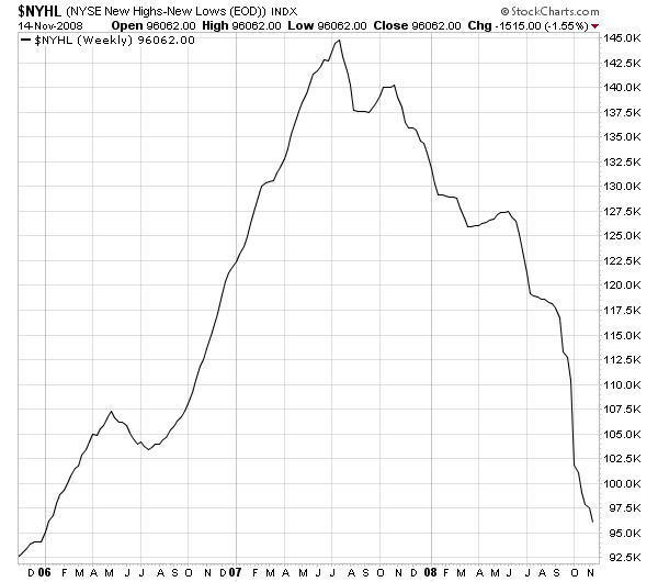
StockCharts.com is all about visually representing what's going on in the markets. Here's a sobering visual representation for you:
Daily NYSE High-Low Line:
Weekly NYSE High-Low Line:
You can view these two charts anytime at http://stockcharts.com/charts/gallery.html?$NYHL
The $NYHL index a market breadth indicator that is calculated at the end of each day by taking the number of stocks making New 52-week Highs on the NYSE and subtracting the number of stocks making New 52-week Lows. Those values are then plotted cumulatively to create the NYSE High-Low Line that you see above.
Because it is a cumulative plot, the actual value of each point on the chart is unimportant. (In fact, they will change if you adjust the starting date of the chart.) What is important is the shape of the line - up is healthy, down is sick.
Get the picture? We're sick. We've been sick awhile. We will probably be sick for a while longer. For long-term ChartWatchers, there's not much point in hopping back into the market until these lines start going up again.
-- Chip
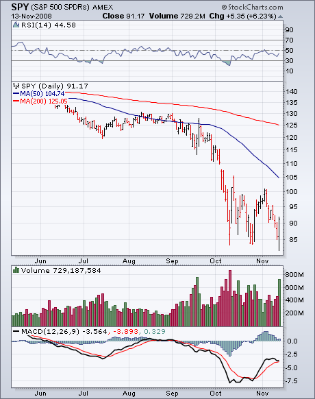
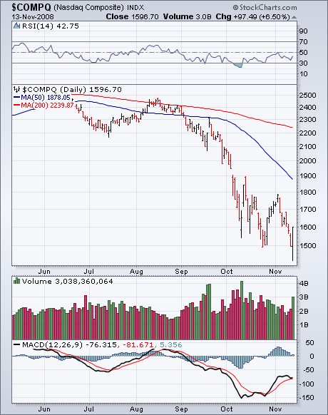
S&P JUMPS 6% AFTER TOUCHING NEW LOWby John Murphy | The Market Message After dropping briefly to the lowest level since March 2003, the S&P 500 achieved an upside reversal day (as did all of the other major indexes) that resulted in a 6% gain. It also did that on the highest volume in weeks. The fact that the S&P touched a new low before rallying is especially impressive (Chart 1). The Nasdaq did the same (Chart 2). The Dow Industrials bounced off psychological support near 8000. The rally was aided by short-term positive divergences in both the daily RSI and MACD lines. Although all market groups participated, the biggest gains were seen in consumer discretionary, financials,REITS, and small caps. Commodity stocks also rallied strongly. Gold and energy stocks gained 12%. The commodity bounce was aided by stronger stocks and a weaker dollar. Many commodity markets were closed during the late stock rally and will probably see more buying tomorrow. Bond prices sold off as stocks rallied.
DOW BATTLES SUPPORTby Arthur Hill | Art's Charts
The Dow Industrials surged off support for the fourth time in five weeks. Will this bounce produce a breakout or failure? As the candlestick chart below shows, the Dow Industrials is locked in a volatile trading range with support around 8000 and resistance around 9700. The Dow dipped below 8250 least four times and surged above 9250 at least three times. Talk about a yo-yo.
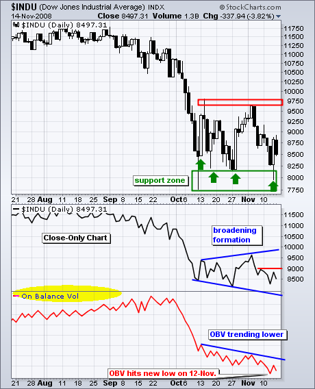
In an effort to weed out some of this volatility, I am also looking at a
close-only chart. There are three dips below 8500 and a broadening formation
is taking shape. These patterns are normally associated with tops, but we can probably apply some reverse logic with one forming after the Sept-Oct decline. Currently, the Dow is moving from the upper trendline towards the
lower trendline, which targets further weakness towards 7800-8000. Thursday's big bounce looks impressive, but it is not quite enough to reverse the two week downswing. Sorry for getting so short-term, but these are big swings we are dealing with. While I was impressed with Thursday's surge, it was just one day and Friday proves that some follow through is needed for confirmation. A close above minor resistance at 9000 would provide such follow though.
The bottom indicator shows On Balance Volume (OBV) moving to new lows this
week. Joe Granville theorized that volume leads price. If this is the case,
then OBV is pointing to new lows for the Dow. Look for a break above the blue trendline and early November high to reverse the downtrend in OBV.
There is also a video version of the this analysis available at TDTrader.com - Click Here.
RYDEX RATIOS DIVERGEby Carl Swenlin | DecisionPoint.com
Decision Point charts a couple of indicators that are useful in determining investor sentiment based on actual deployment of cash into Rydex mutual funds. The Rydex Asset Ratio is calculated by dividing total assets in Bear plus Money Market funds by total assets in Bull funds. The Rydex Cash Flow Ratio is calculated by dividing Cumulative Cash Flow into Bear plus Money Market funds by Cumulative Cash Flow into Bull funds. (A thorough discussion of these ratios can be found in the Glossary section of our website.) When total assets in a given fund increase/decrease, the cause is an advance or decline in the fund's shares; however, there is also a component of the amount of cash moving into and out of the fund. This is why we have the two indicators.
On the Assets Ratio chart below, we can see that the Ratio is deeply oversold, implying that sentiment is very bearish, and that an important price bottom is being formed. This oversold reading is a direct result of the severe market decline depressing bull fund prices and inflating bear fund prices. The next chart shows a completely different picture.
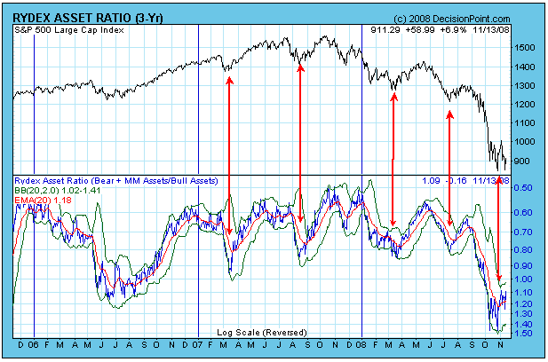
While the Asset Ratio is oversold and bullish, the Cash Flow Ratio below is overbought and bearish. It is telling us that investors are quite bullish, and that a decline should be expected. That the two Ratios have diverged so severely is a very unusual situation, so let's take a closer look at what happened.
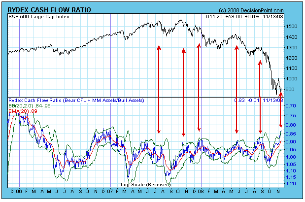
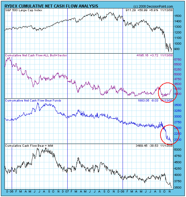
The next chart shows that, when the market began to consolidate, cash flowed out of bear funds and into bull funds. I can think of no other reason except that Rydex investors were anticipating a rally and trying to pick a bottom. This is bearish. I should emphasize, however, that the Ratios reflect the activity of a relatively small percentage of total market participants. Nevertheless, these indicators have a good performance record and are useful tools.
Bottom Line: The current divergence of the Rydex Ratios leaves us in a predicament as to which we should believe. In my opinion, the Cash Flow Ratio shows what is happening beneath the surface of asset totals, and it should be the first to be believed.
LOOK UNDER THE SURFACEby Tom Bowley | InvestEd Central This has been one ugly bear season. It cannot be compared to anything else seen on the S&P 500 since 1950. Not even close. But I'll say one thing - there's an awful lot of horrible economic news priced into this market right now. I am convinced that the worst is behind us. That doesn't mean we won't continue to see horrendous economic reports. This will be a holiday shopping season that every retailer in America had wished they could have skipped. We will see hundreds and hundreds of thousands of jobs lost in the coming months. As a result, home prices are nowhere near stabilizing yet. And without home prices stabilizing and economic improvement, banks aren't exactly sitting in the catbird seat either.
But the market prices these things in. That's why we've seen the NASDAQ drop 37.1% in the last 10 weeks. The S&P 500 and the Dow Jones aren't far behind, down 32.9% and 27.5%, respectively, during these last 10 weeks. The NASDAQ, from November 4th's close to the intraday low on November 13th, lost over 350 points, or 19.75%, in less than 7 trading days. Most technicians trying to time market bottoms using their trusty, dusty MACD's and OBV's and SUV's (oops, wrong story!), have erred miserably. They haven't worked with the precision most technicians have grown accustomed to. Instead, this wild market ride has been 100% about emotion. Sentiment indicators have worked like a charm. Two weeks ago, I commented that the VIX had just broken beneath its 20 day EMA for the first time in 2 months and that I was looking for a drop to 46. A couple days later, it hit 44 and change before bouncing again. Now the 50 day SMA on the VIX becomes an important level on a closing basis. Also, the put call ratio and the various moving averages that we use to identify "relative" complacency and pessimism have been of utmost importance in spotting key short-term reversals. Literally, on Thursday as we were wrapping up our noon chat and folks were exiting, I took a final look at the latest put call reading that was published at 1pm EST and it provided us with the final clue to start buying. The "equity only" put call ratio - during just one half hour reading - showed over 200,000 equity puts purchased and just 98,000 calls bought. That half hour ratio was over 2 to 1 in favor of puts, something I cannot ever recall seeing on the equity only reading. The market EXPLODED higher from 1pm on Thursday. Check out this 2 day chart on the NASDAQ:
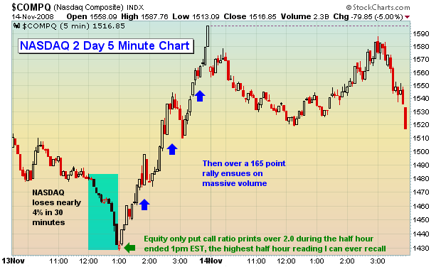
We recorded the last few minutes of that chat session on our website for anyone wishing to listen to my shock and dismay following that put call reading! Reviewing sentiment indicators like the put call provides opportunities that otherwise would be missed using standard technical indicators and it's why it's such a huge part of our trading arsenal.
The MACD (dare I say!) has turned decidedly bullish on the daily charts. We have a long-term positive divergence in place as shown below:
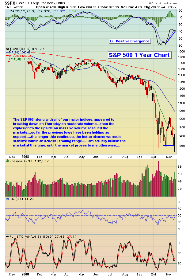
The market appears to be at or rapidly closing in on a tradeable bottom. We believe the risk/reward is such that aggressive traders could look to enter long positions in increments during further weakness. Let's not forget, this Friday is options expiration and MAX PAIN!!!
As always, keep those stops in place!
Happy trading!
Join Tom and the Invested Central team at www.investedcentral.com. Invested Central provides daily market guidance, intraday stock alerts, annotated stock setups, LIVE member chat sessions, and much, much more.


