Hello Fellow ChartWatchers!
Welcome to 2008! The start of a new year is always a good time to look for the big-picture perspective on things and few things say "Big Picture" better than the Bullish Percent Indices. By condensing the technical picture for 500 important stocks down into just one number, the S&P 500's Bullish Percent value ($BPSPX) gives you a great indication of the overall health of the market. Check it out:

Starting in 2004, the BPI settled down into a nice little pattern - rallying after hitting 50% (green arrows) and then reversing soon after passing 75% (red arrows). It repeated this pattern four times as you can see. At the start of 2007 however, something changed - the BPI bounced between 70% and 80% a couple of times, then fell sharply and didn't bounce at 50% for the first time in years (blue arrow). When it finally bounced in September, the BPI was down around 33% (purple up arrow) which was its lowest reading since March 2003. The biggest warning sign came soon afterwards when the BPI was only able to rally back up to 70% before falling again (purple down arrow). That was its lowest "peak" in years and a real sign of weakness. The weakness was confirmed in December when the BPI only rallied back up to 56% - a very troubling sign indeed.
Remember, these numbers represent the charting "health" of the 500 biggest stocks in the market - and the diagnosis isn't looking promising right now.
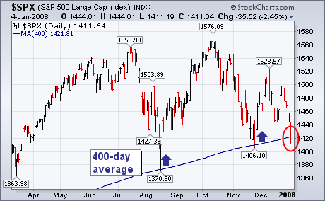
During the August market drop, I wrote about the importance of the 400-day moving average as a major support line. [That line is gotten by converting the 20-month moving average to a daily line. I'll show why we use that line shortly]. The daily bars in Chart 1 show the August and November price declines bouncing off that long term support line. The chart also shows, however, the S&P 500 closing below that support line today. [That's the first Friday close below that line in five years]. The 400-day line also resembles a "neckline" drawn below the August/November lows. That's another reason why today's breakdown could have bearish implications for the S&P 500 and the market as a whole. A close below the November intra-day low at 1406 would be further confirmation of today's moving average violation. Chart 2 shows why the 400-day line is important.
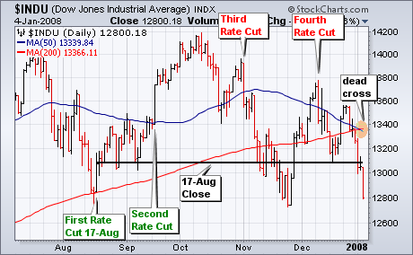
The Fed started cutting interest rates on August 17th with a surprise 50 basis points cut in the Discount Rate. There have been three more rate cuts since 17-Aug, but the Dow Jones Industrial Average has nothing to show for these cuts. The first two rate cuts fueled the rally from mid August to mid October. However, the last two rate cuts coincided with reaction highs on 2-Nov and 11-Dec (third and fourth cuts). The negative reaction to the last two rate cuts indicates that something is rotten in the kingdom of stocks. With Friday's employment report, the Dow moved below 13000 and finished the week below the 17-Aug close. The Dow is now down after four rate cuts. The bearish argument was further reinforced this week when the 50-day moving average moved below the 200-day for the first time since November 2005. This is also know as a "dead cross".
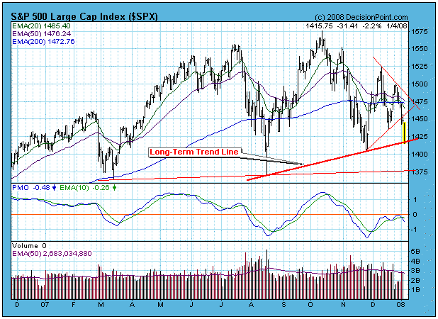
Currently, the stock market is still in the process of retesting the November lows. This process needs to end now or some serious technical damage will be done, specifically the long-term rising trend line is in danger of being decisively violated. On the chart below you can see the long-term rising trend line is being tested, and a decisive violation would be a decline to about 1375, where coincidentally there is another support line. Unfortunately, that doesn't give me much comfort because that line looks a lot like the neckline of a rounded or double top, and considering that a decline to 1375 will generate long-term moving average sell signals, my guess is that the chances of the neckline holding or surviving a retest would be slim to none.
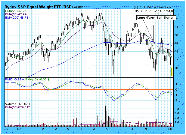
The next chart gives us a view of the S&P 500 on an equal-weighted basis, and the picture is not pretty. Normally, an equal-weighted index will out-perform it's capitalization-weighted counterpart because the index is boosted by the smaller-cap components. However, in recent months the equal-weighted index has been under-performing the S&P 500 Index to the extent that the 50-EMA has already crossed down through the 200-EMA, a long-term sell signal. What this tells us is that money is focusing on the large-cap stocks the S&P 500 Index is being supported by fewer and fewer stocks.
If you are wondering if the 9-Month Cycle has made a low, so am I. I have tentatively identified the trough as being in mid-December, but, since prices have fallen below the mid-December level, I'll have to rethink that after things have shaken out. This is not a satisfying conclusion, but this is often the way it is â cycle projections are good for a longer-term estimate, but it is hard to nail down the exact trough until after the fact.
Bottom Line: It is not impossible for the market to complete a sucessful retest and for the bull market to continue, but the tecnicals are worse than they have been since the last bear market ended, and it is difficult to be optimistic at this point.
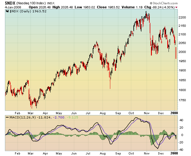
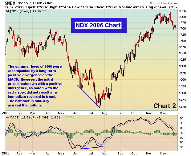
We've been following the bond market closely and for good reason. Earnings and interest rates drive the stock market. We are seeing a lot of signs of an economic slowdown, perhaps even a mild recession. As a result, earnings will not be spectacular and we'll likely continue to see companies lowering guidance. The equity markets are already discounting prices to account for lower profits in first half of 2008. Stocks have taken a huge hit to begin 2008, but divergences are indicating that selling momentum is slowing similar to what we witnessed in the summer of 2006. One of the hardest hit indices last week was the NASDAQ 100. Take a look at Chart 1 below and note that as the NASDAQ 100 has hit new recent lows, the MACD is actually much, much higher than it was at the time of the last low. This is a development worth watching as the same situation developed in the summer of 2006 before a significant advance.&n bsp; That setup can be seen in Chart 2.
Expect the Fed to continue lowering interest rates. We believe the next cut will be 50 basis points and we wouldn't be shocked to see the Fed step up prior to its end of January meeting and introduce this next cut between meetings. The bond market is clamoring for more rate cuts with the odds of a 50 basis point cut increasing. In previous articles, we've discussed the likelihood of falling interest rates as a result of the triangle breakdown on the ten year treasury yield. If that yield falls below 3.80%, there is little support until the yield reaches 3.05%. That would portend an aggressive rate cutting campaign by the Fed, which we believe is in our future. Continued decreases in interest rates will send "safe" money in the bond market back to equities as investors look for higher returns. Lower rates will further weaken the U.S. dollar, providing greater opportunities in gold and other commodities.
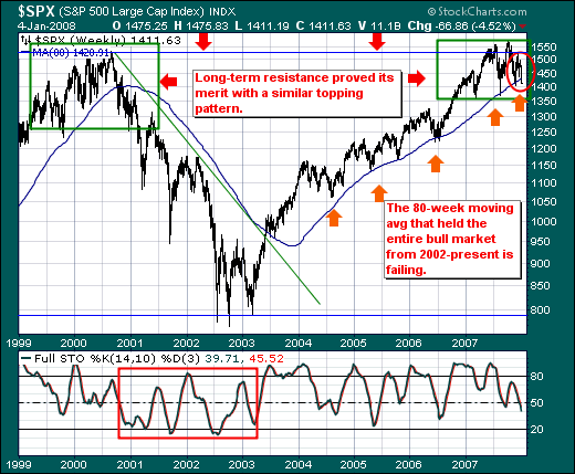
The S&P 500 is off to its worst start to begin a new year since 2000; however, this isn't the larger headline to us. If were writing the story, the headline would indicate the probability of a bear market having begun rose significantly last week; but it did not do so given the very poor US employment report. It did so given our demarcation line between "bull and bear markets" â the 80-week moving average â was violated in earnest last week. We don't take this signal lightly; nor should our clients.
As the S&P 500 Weekly chart illustrates, there is a bit of "symmetry" between the 1999-2000 topping pattern and the current topping pattern as each was unable to breakout above the 1550-1577 zone. In the 2000-2002 bear market, prices clearly broke through the 80-week moving average and didn't look back. It wasn't until 2002 that prices were able to regain this moving average, which signaled the start of the cyclical bull market. Of note, prices successfully tested and retested this moving average numerous times prior to last week's breakdown. Hence, its significance can't be understated.
And one final note. In the first paragraph â we stated the "probability" of a bear market now underway has "risen significantly." We won't sound an all out "bear market call" until the 30-month exponential moving average crossing at 1381 is violated... a mere 30 points lower from current levels.