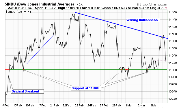
STRUGGLING WITH 11,000
The Dow continues to test the big breakout about 11,000 it had last month. Here's a chart of the recent action on a 15-minute scale which shows how the initial push has waned and how 11,000 is providing major support for the index (and the market) right now.
MID-CAPS ON A ROLL
This week we added one of the last big features we needed to add to SharpCharts2 - Performance mode. Similar to "Cumulative" mode which we've supported for years, Performance mode changes the main charting area so that a stock's percentage gain over time (since the left edge of the chart) is plotted. Combine Performance mode with SharpCharts2 ability to overlay just about anything on anything and you end up with charts like this:
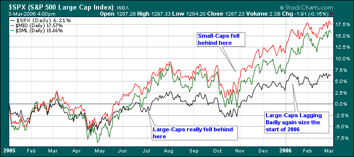
Pretty cool eh? An annotated PerfChart that members can store in their lists for later review! As you can see on this one, Mid-Cap stocks have been the clear winners since the start of 2005. There have been 2 periods where Large-caps have lagged badly (including right now).
SHARPCHARTS2 PROGRESS REPORT
SharpCharts2 is now the Official charting tool for our Free Users. Late last week we retired the SharpCharts1 workbench for those folks and are working hard to help them understand the changes and the new power that SharpCharts2 gives them. If you are one of our multitude of free chart users, you now have:
- One additional overlay and one additional indicator per chart
- The ability to create overlaid charts
- Candlevolume, EquiVolume, Three-Line Break, and Performance Mode charting
- Many more technical indicators such as the Force Index
- New color and line style choices
- Better printing support
- More chart size options
- ...and much more!
If you are new to SharpCharts2, I urge you to take a moment and read the "Instructions" page before continuing (just click the "Instructions" link below any SharpCharts2 chart). SharpCharts2 can do everything that SharpCharts1 can do and more - BUT - somethings are now done differently and the "Instructions" page explains those differences.
If you are a member of our Basic or Extra services, for now NOTHING HAS CHANGED! You still need to use the SharpCharts1 workbench to manage your stored charts. Over the next couple of weeks, we will continue to slowly integrate SharpCharts2 into our site more and more. Once that is done, we will automatically convert all of your saved charts into SharpCharts2 format and at that point, SharpCharts1 will be a thing of the past. MAKE SURE YOU START USING SHARPCHARTS2 NOW in order to minimize the problems that this upcoming conversion will cause.
GREG'S NEW CANDLESTICK BOOK IS ALMOST HERE
In case you missed the bookstore ad above, we are now taking pre-orders for Greg Morris' updated CandleStick book. This book is a follow-up to Greg's hugely popular "Candlestick Charting Explained" which has been a best seller for years. Greg's updated book has been completely reworked and greatly expanded. It will be an instant "Must Have" book for chartists. Why not go ahead and order your copy now?
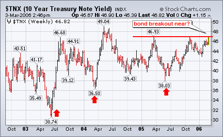
Yesterday's decision by the ECB to raise rates was pretty much expected. What wasn't expected was the hawkish comments that accompanied that rate increase with hints of more to come. The Japanese have been talking about doing the same and may do so before the month is out. From a global standpoint, I find the impending Japanese move to raise rates more significant. For one thing, Japan is the second biggest economy in the world. Another reason (that I've written about before) is my belief that Japanese deflation has been one of the reasons that long-term bond yields have stayed so low. Yields on the Japanese 10-year bond rose this week to the highest level in eighteen months (1.64%). It was reported this morning in Tokyo that core consumer prices rose 0.5% in February which is the highest since 1998 (when global deflationary problems started). Earlier this year, I wrote about the correlation between with the rise in the Japanese stock market (which hinted at an end to Japanese deflation) and the rise in gold. Both are pointing to higher global inflation and interest rates. Up to now, only the U.S. has been raising short-term rates which may explain why bond yields have stayed down. With the rest of the world starting to raise rates as well, I suspect that bond yields are finally starting to move higher. Chart 6 shows how close they are to doing just that.
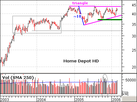
HD is no stranger to long consolidations. The stock surged in 2003 and then consolidated for a year (gray box). The advance continued with a surge in 2004 and the stock consolidated over the last 12 months with a large triangle. The gains from 2003 and 2004 are largely holding and the ability to maintain high prices is bullish.
The next big move, however, is dependant on the direction of the consolidation breakout. A move below 37 would break key support and be most bearish. A move above 44 would break the upper trendline and 2005 high. This would forge a 52-week high and project a move to the mid 50s. I found this target by adding the width of the triangle to the breakout point (44 + 10 = 54). Such a move would be bullish for the stock, the retail group, the Consumer Discretionary sector and the overall market.
Volume and broad market strength favor a break to the upside. First, the broader market is strong right now. The Dow recently broke to a 4 1/2 year highs and the S&P 500 is holding its November breakout. Second, upside volume (black volume bars) in Home Depot has been outpacing downside volume (red volume bars). The Oct-Nov surge featured good volume (gray oval) and upside volume has been higher than downside volume in 2006. Volume often precedes price and this points to an upside breakout.
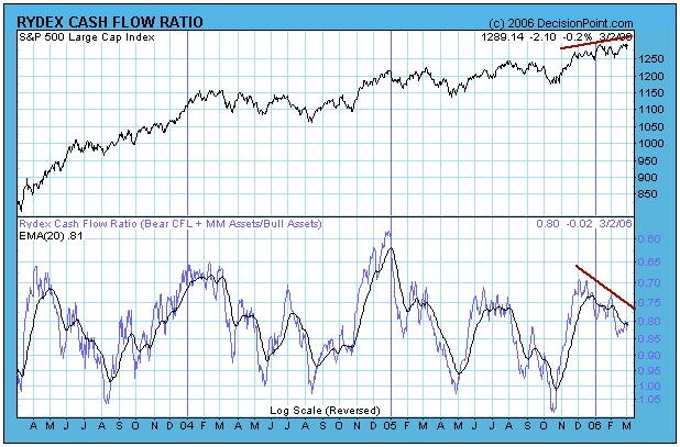
The Rydex Cash Flow Ratio*, which is shown on the first chart below, reflected a fair amount of bullish sentiment and peaked around the end of November. Since then it has been sliding down toward the bearish side of the range in spite of the fact that prices have been moving higher. This is not normal -- prices normally drive the Ratio as money flow adjusts to price movement.
My first conclusion was that over-anxious bears were placing their bets too early and driving prices higher with their short covering; however, a closer examination of the Ratio's components reveals that something quite different, and dangerous, is taking place.
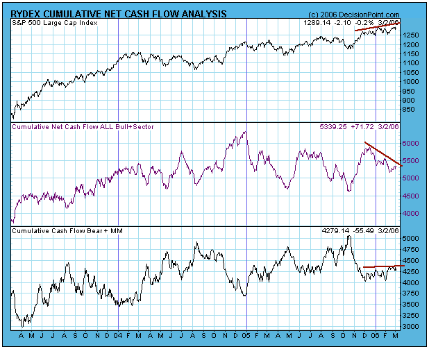
The chart below shows the components of the Cash Flow Ratio. Note that, since November, bear plus money market funds cash flow has been flat to slightly rising, demonstrating clearly that the bears have been relatively patient.
On the other hand, cash flow for bull plus sector funds has decreased dramatically. This means that money has been moving out of bullish funds even though prices have moved higher. This is almost always a bad sign.
To summarize, the Rydex Cash Flow Ratio divergence does not reflect premature bearishness, rather it shows that many people (smart money?) are quietly moving toward the exits. This is just one of a long list of divergences that can be observed on our indicator charts, and, even though the trend of the market is still up, increased caution is appropriate.
RYDEX CASH FLOW RATIO: The Rydex Cash Flow Ratio gives an improved view of sentiment extremes by using cumulative cash flow (CCFL) into Rydex mutual funds rather than using the totals of assets in those funds (which we use for the Rydex Asset Ratio). It is calculated by dividing Money Market plus Bear Funds CCFL by Bull Funds plus Sector Funds CCFL. To read more click here.
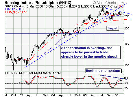
Sometimes the best trade is the most obvious trade; and for us that is the ?short housing? trade, or more succinctly?short the homebuilders. Interest rates moved sharply higher this week on the short-end as well as the long-end of the curve, and ht prospects are good for a continuation of this move. Thus, there is a fundamental component to the trade.
As the chart shows, the uptrend was clearly violated, with a ?head & shoulders? topping pattern still under development. If $HGX breaks 235 ? and we think this is a ?good bet? given the 50-week moving average is rolling over with prices headed lower through it ? then much lower target projections are ahead. Perhaps a loss on the order of another -25% from current levels; the risk is to a move above 275 or -7%. We like the risk-reward?and are involved in the trade.