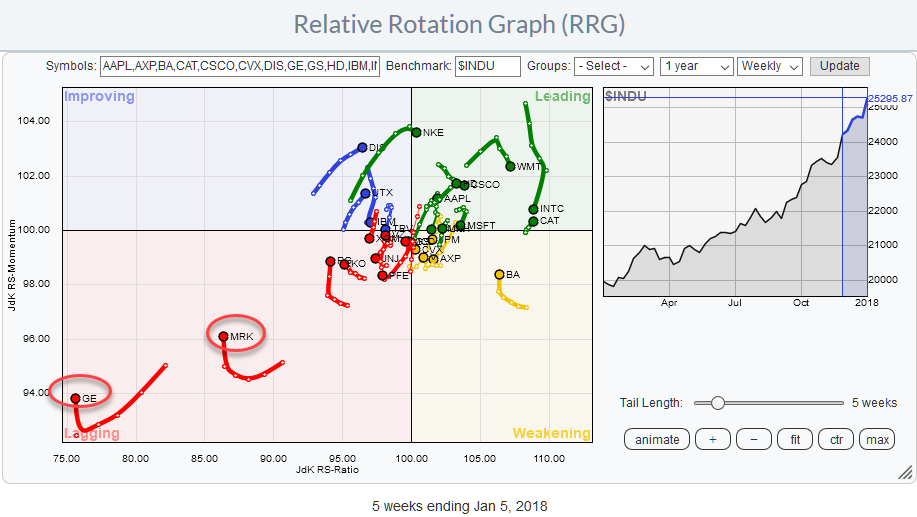
The Relative Rotation Graph shows the members of the DJ Industrials index against $INDU. This is a so-called closed universe which means that all elements that make up the universe are present in the plot. If we would calculate all the distances (vectors) from the center of the chart to the various stocks (market cap weighted) and add them up the result would be zero.
The two stocks that immediately stand out are GE and MRK, although both are showing an uptick in relative momentum (rising JdK RS-Momentum)they remain deep inside the lagging quadrant.
Browsing through the individual members of the DJ Industrials index on the Relative Rotation Graph while looking for positive or negative RRG-Headings, reveals potentially interesting rotational patterns for BA, CAT, and CVX inside the weakening and improving quadrants.
At the opposite side, I noted a weak rotational pattern for JNJ while the uptrend on the price chart for this stock is still intact. Reason enough for a closer look at JNJ’s technical picture form both a relative and a price perspective.
Summary
- GE bouncing off long-term support, short rally possible but way too low on JdK RS-Ratio scale for a turnaround of the relative trend.
- MRK expected to show continuing relative weakness after recovery rally
- Break below $ 135 in JNJ will accelerate and trigger more relative weakness
- BA, CAT, and CVX, are showing strong price charts and their tails are curling up again on the Relative Rotation Graph
Struggling inside the lagging quadrant
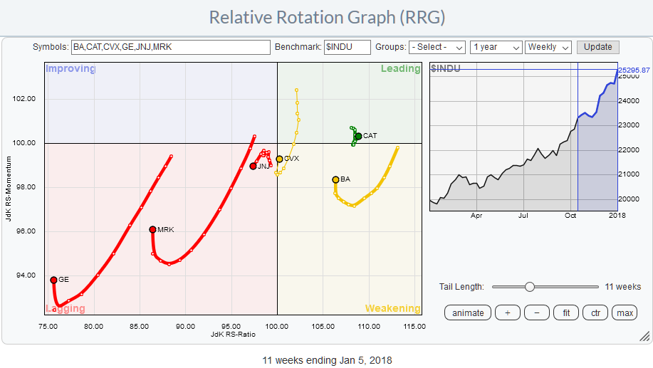
Inside the lagging quadrant on this, zoomed in, RRG we see GE, MRK, and JNJ with GE and MRK struggling to move higher on the JdK RS-Momentum scale while JNJ seems to be picking up relative weakness and accelerate deeper into the lagging quadrant.
General Electric Co. - GE
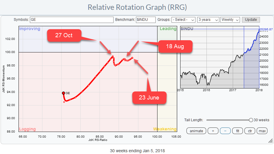
The zoomed in RRG shows the rotation for GE through the lagging quadrant since roughly June/July 2017.
Initially, the weekly observations were pretty close to each other, and GE moved more or less straight left. Lower on the JdK RS-Ratio scale and around the same levels on the JdK RS-Momentum scale.
From 27 October onward the tail started to gain in length and pointing at an RRG-Heading between 180-270 (South-West), indicating that negative momentum was picking up and the stock continued to continue its underperforming trend versus the DJ Industrials index.
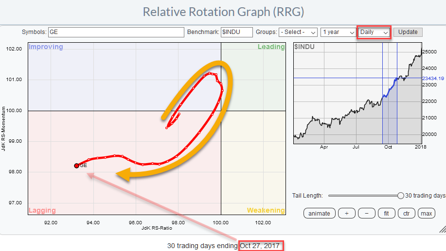
The strange turn around 27 October (on the weekly RRG) which seems to be not clock-wise is a good example of how the rotational nature always keeps coming back at shorter time frames. If we switch the weekly time frame for the RRG above to a daily (see image below), the rotational pattern shows up again. It was just too fast for the weekly RRG to pick it up.
The price chart in combination with the relative charts does not reveal a lot of good things. The RS-Line rolled over in 2016 pushing GE into the lagging quadrant on the Relative Rotation Graph somewhere in May.
From their on GE’s relative strength against the DJ Industrials index continued to slide despite the fact that price managed to hold up well during the second half of 2016. When support around $ 27 got broken downward things started to weaken further, and the downtrend in relative strength started to accelerate pushing GE deeper into the lagging quadrant at a faster pace.
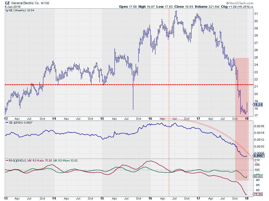
A few weeks ago GE found support at a long-term level coming off the 2011 and 2012 peaks which were tested as support in 2013 and again in 2015 during that spike down.
This time the test of that long-term support level seems to be a bit more solid and serious as the price has been hovering around and above that level ($ 17.50) for a few weeks now and just jumped higher to $ 18.50.
Does this make GE a buying candidate? Not for me, not yet at least. The downtrends in both price and relative strength have been so strong that it is almost impossible to rotate all the way back up towards and into leading in one move.
It is more likely that another rotation on the left-hand side of the RRG will be needed.
Shorter-term traders can look for trades towards the first resistance level near $ 21 but remember you are trading against the trend.
Merck & Co. - MRK
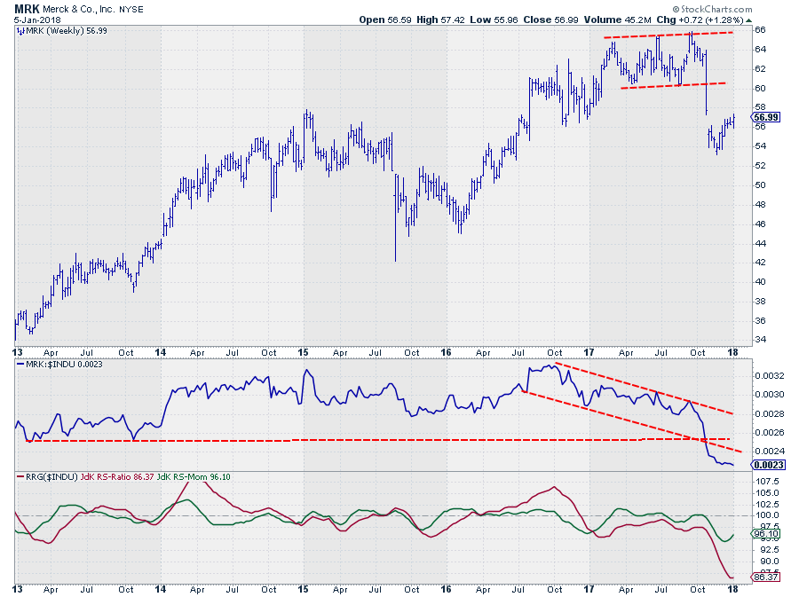
MRK is the second stock in the lagging quadrant that is far away from the center of the chart at very low RS-Ratio and RS-Momentum values but recently moving higher on the RS-Momentum scale. Just like GE, this does not make it a buying candidate, not even close.
The JdK RS-Ratio for MRK dropped below 100 at the end of 2016 and never managed to return above it, following the trend in the RS-Line lower. The JdK RS-Momentum line oscillated above and below 100 a few times causing the rotations on the left-hand side of the RRG chart.
The sharp decline in October on the price chart pushed MRK out of the consolidation, and turned it into a big topping formation; it had been in since the beginning of the year. This accelerated the relative move lower and pushed MRK deeper into the lagging quadrant.
The recent uptick in price has to be seen as a recovery after a sharp decline. This move faces a lot of overhead resistance levels but could ultimately reach the $ 60 area again (breakout level).
With MRK being at the position where it currently is on the RRG, we can be pretty confident that a rally towards $ 60, if we even get there, will not be enough to bring MRK back to the right-hand side of the plot. Just like for GE, here also a rotational pattern at the left-hand side of the graph is likely.
Johnson & Johnson - JNJ
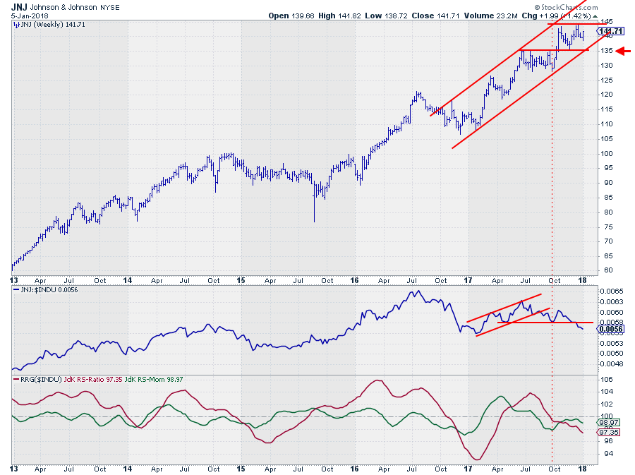
A third stock, inside the lagging quadrant, that I would like to have a look at, because of its negative RRG-Heading, is JNJ.
JNJ moved into the lagging quadrant from weakening at the end of September. At that time the negative relative momentum did not continue, and JNJ started to pick up a bit on the JdK RS-Momentum axis albeit with very small incremental values from week to week, and JNJ remained well within the boundaries of the lagging quadrant.
Since three weeks, however, JNJ started to accelerate deeper into lagging with an increasing tail length which is not good from a relative perspective and suggests that more relative weakness (IE under-performance against $INDU) is underway.
The price chart is telling a slightly different story. For sure it is not such a star chart as seen for other DJI members, but still, it is a regular pattern of higher highs and higher lows contained within the boundaries of a rising channel. Pretty much all we would like to see for an uptrend.
I am taking the relative weakness as a (serious) warning signal and with the recent rally failing to take out the previous high, looking at potentially a double top being formed. For that double-top to complete and trigger the signal a break of support at $ 135, where the previous high and low as well as the rising support line are coming together, is needed.
For now, it's "wait and see," but things do not look good for JNJ.
Strong price charts and tails curling upward on Relative Rotation Graph.
Based on their position on the Relative Rotation Graph, combined with their RRG-Heading I have picked CAT, BA, and CVX, for further inspection as interesting stocks to watch.
Boeing Co. - BA
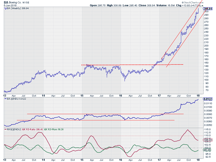
BA moved into the weakening quadrant on the RRG in the week of 20 October last year. At that time it was the stock with the highest JdK RS-Ratio reading inside the DJ Industrials universe. In the week of 8 December, the downward pressure (declining JdK RS-Momentum) started to level off, and the length of the tail on BA started to shrink as it started to curl upward again.
This positions BA inside the weakening quadrant on the RRG at the moment and turning towards a strong(er) RRG Heading suggesting that another up-leg in the strong relative trend is underway.
From a price perspective, there is nothing that is, potentially, holding BA down. The steep uptrend as seen in 2017 has strongly continued into 2018, and within the boundaries of the rising channel, there is plenty of room for BA to take a breather without hurting the trend.
The recent rotation from leading to weakening is the result of the raw RS-Line moving flat for a few weeks over the summer and the recent break to new highs, here as well as in price, causes the improvement in RRG-Heading and suggests that a continuation towards the leading quadrant is underway.
This makes BA one of the stronger stocks inside the DJ Industrials index.
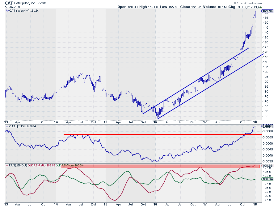
Caterpillar - CAT
Looking at the chart of CAT and its position on the Relative Rotation Graph reminds me of a time back in the day when I was working as a sell-side analyst at the trading floor of a Dutch investment Bank. RRG did not exist at that time, and I was publishing technical and quantitative research for our institutional clients.
Already back then these PMs were bombarded with emails, phone calls, and research reports. To get their attention you needed to come up with something that would draw their attention to your publications.
I don’t recall exactly anymore when it was but I was very bullish on the stock market as a whole so what I wanted to do is put a picture of a huge truck on the front page of my report with a headline along the lines of saying that it was time to massively load up on stocks and you needed a big truck for that.
After a bit of research it appeared that at the time the biggest truck was produced by Caterpillar and so it happened, a picture of the biggest CAT in the world was published on the cover page of that report.
From an RRG perspective, there is no doubt, at the moment CAT is the strongest stock in the Dow. It has the highest RS-Ratio and a positive RRG-Heading. A look at the price chart reveals a stellar uptrend that started in the early days of 2016 and started accelerating when the upper boundary of the rising channel was broken upwardly in the second half of 2017.
With all these positive reading the big question that remains to be answered is: “Would you buy CAT at this very moment in time?”.
The answer, at least for me, “probably not.” “Would you sell it?”, No!
If it is in a portfolio already it will very likely be one of the star performers, and the stock is pushing to new highs almost every week, that’s not a reason to sell…
From a relative perspective CAT has not yet taken out its relative highs, these were formed in 2011 and 2012, and on the Relative Rotation Graph, CAT reached levels well above 110, up to 115, a number of times between 2001 and 2010. So historically there is definitely more room for, relative, upside potential.
What holds me back is the risk associated with the current high readings on both the price- and the relative charts.
Yes, they look strong, but with all these gains the downside risk is increasing as well, a bit too much to my tasting. There are probably better opportunities to be found within the DJI with a better risk/reward ratio.
Chevron Corp. - CVX
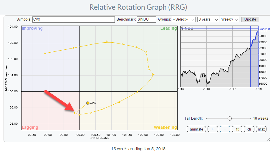
CVX rotated into the weakening quadrant from leading towards the end of November. This happened around 102 on the JdK RS-Ratio axis which is fairly, or maybe better ‘dangerously’ close to the 100 level. The following weeks CVX moved, rapidly, towards the lagging quadrant and a new relative downtrend seemed to be in the making when CVX actually crossed over into lagging.
Just recently, however, CVX managed to turn around back into the weakening quadrant at a positive RRG-Heading (0-90 degrees)after just one week inside lagging.
This is a rotational pattern that does not happen very often. 21 occurrences in all 30 Dow stocks over the past ten years but the results are good. In more than 70% of the cases, the 12-week return (after the rotation happened) was positive averaging an outperformance over $INDU around 3%.
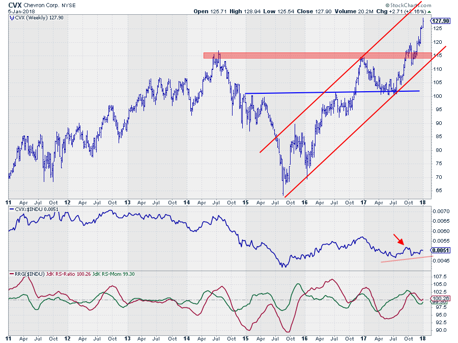
Looking at the price chart, we see that CVX also has broken to new highs but not, yet, made a run like CAT for example. The price is still well within the boundaries of its rising channel with plenty of upside potential available as well as ‘room to breathe’ before it starts to break support levels.
This combination of observations makes me prefer CVX over CAT as a buying opportunity at this point. The risk/reward ratio just seems to be in better shape.
Did you like the article or have any questions? Please drop a comment. Would you like to receive a notification when a new article in the RRG blog is published? Simply "Subscribe" and leave your E-mail address.
Julius de Kempenaer | RRG Research
RRG, Relative Rotation Graphs, JdK RS-Ratio, and JdK RS-Momentum are registered TradeMarks ® of RRG Research
Follow RRG Research on social media:
If you want to discuss RRG with me on SCAN, please use my handle Julius_RRG so that I will get a notification