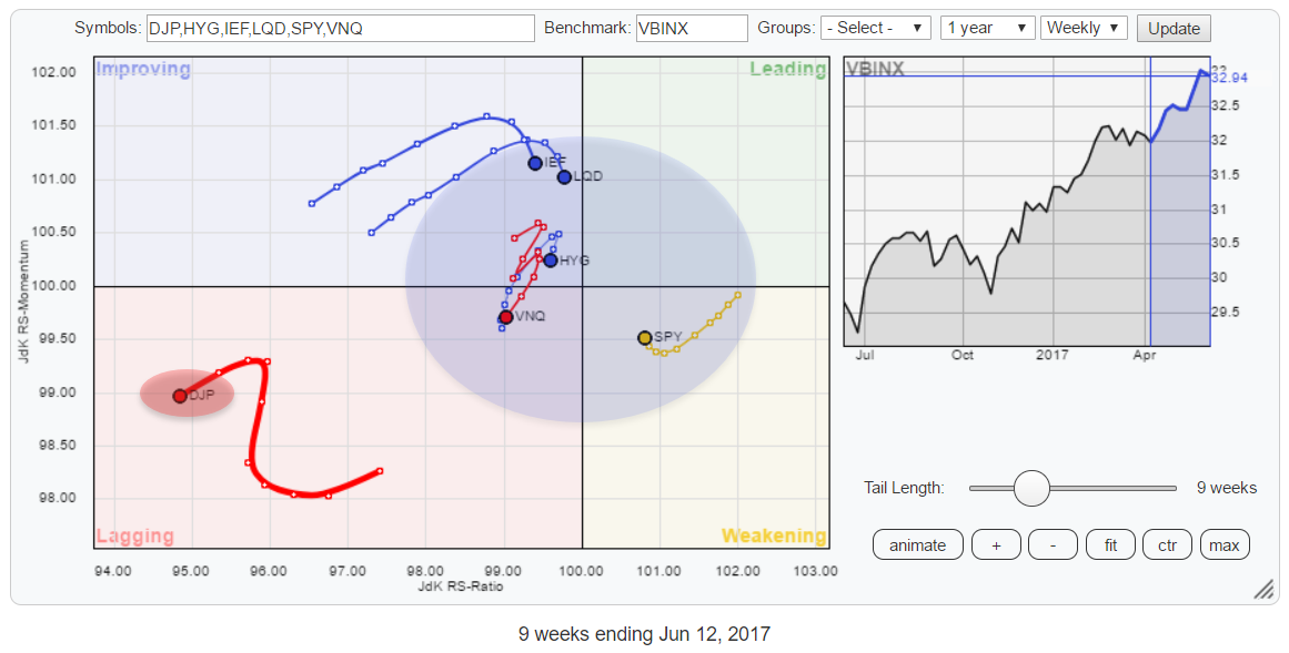
 This Relative Rotation Graph for Asset Classes shows Commodities (DJP) far away in the bottom-left corner of the chart, completely detached from the others.
At, by far, the lowest readings on the JdK RS-Ratio axis, DJP moved higher on the JdK RS-Momentum axis for a few weeks but recently turned left again, diving even deeper into the lagging quadrant.
The Asset Class Rotation remains characterized by still NO asset classes inside the leading quadrant at all and only one, SPY (Equities), at the right-hand side of the graph. This makes a very good visualization for the TINA acronym.... There Is No Alternative!
TINA is used to indicate that investors keep coming (back) to equities as other asset classes do not provide enough returns despite a multi-year bull market, high valuations and overstretched trends.
Summary
- Commodities rotating far away inside lagging, completely detached from other asset classes
- Still no asset class inside the leading quadrant on the RRG for asset classes
- Equities (SPY) only asset class on right-hand side of RRG plot
- VNQ throwing curveball
- Equity/Bond rotation pointing to renewed strength for Equities
The RRG above shows the weekly rotation for this universe of asset classes. What is interesting to see are the curves, rotations, that seem to be setting up over the past few weeks for Equities (SPY) on the right-hand side of the graph and Bonds (IEF and LQD) on the left-hand side.
After a period of losing strength on both axes and heading South-West inside the weakening quadrant, SPY started to turn back up again over the past few weeks. The opposite happens with IEF inside the improving quadrant. During the better part of April and May, bond related asset classes moved higher on both the RRG axes but very recently (past two weeks) they started to roll over and lose Relative Momentum while still on the left-hand side of the RRG.
Assuming a continuation of the rotational pattern, this suggests that SPY will soon start to take over the lead from bonds again and push back into the leading quadrant. Worth a further investigation of both the IEF and the SPY charts.
Daily rotation
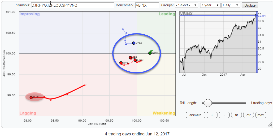 The daily rotational picture for this universe confirms what we see on the weekly picture to a large degree.
First of all, here as well, commodities are very far away from the other asset classes. But also on the daily RRG, we find SPY as the only asset class on the right-hand side of the plot.
The only asset class, sending mixed signals is Real Estate (VNQ) which is pointing lower into the lagging quadrant on the weekly chart but just made an abrupt pull to the right on the daily chart.
Commodities - DJP
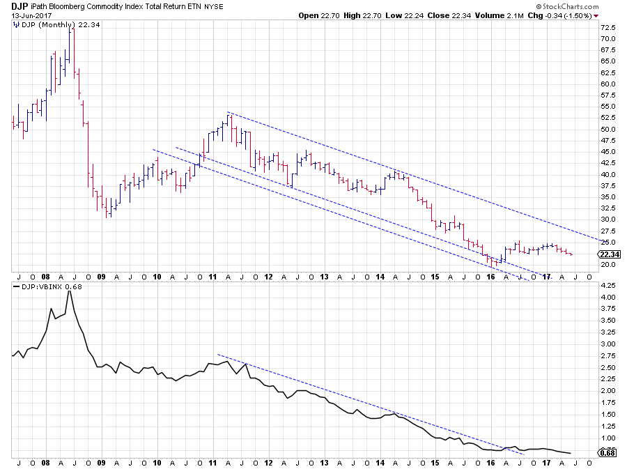 The big trend in commodities is clearly down starting from the peak in 2011. The monthly bar chart above shows a regular series of lower highs and lower lows working their way lower within the boundaries of a falling trend channel.
In this bigger scheme of things the improvement that was/is visible since early 2016 has not made a difference yet.
 Zooming in on developments over the past three years in combination with the RRG-Lines shows that the upward break, out of the two-year declining channel (2014-2015) only had a limited effect and did not manage to bring the big turnaround.
In the first few months of 2016 DJP managed to rally to a high around $ 26 but after that lost its pace and stayed within the boundaries of a sideways trading range. Until now.
Another, even more, zoomed in, chart is needed to see what is going on at the far right of the chart in the past few weeks.
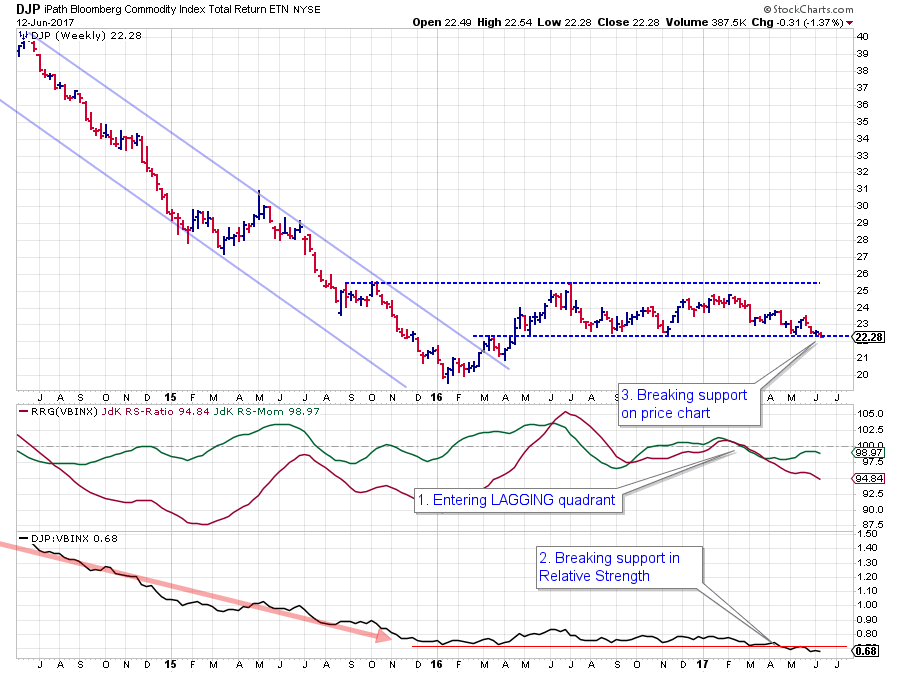
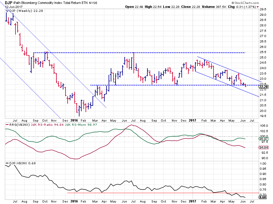 Here it is seen that DJP is on the verge of breaking the horizontal support barrier that served as the lower boundary of the trading range over the past 18 months or so. As it is a weekly chart, it is still a bit premature because only at the Friday close we will know if we have a clear cut break of support or not.
But even if DJP manages to fight its way back above, say $ 22.50, the series of lower highs and lower lows since the beginning of this year is still there and weighing on the price.
However, the relative development of DJP against VBINX, the balanced benchmark that I use to compare this universe of asset classes, started to deteriorate already in February / March.
At first, the RRG-Lines jointly dropped below a 100, pushing DJP into the lagging quadrant. This was then followed by a break of the RS-Line below its previous lows, signaling an acceleration of the relative decline. And now we are on the verge of DJP breaking below a major support level on the price chart.
All in all, these are some serious signs of, renewed and continuing, weakness that should not be ignored. For the time being, I maintain a very cautious approach to commodities.
Real Estate - VNQ
Below are the weekly and the daily RRGs for the asset class universe. In both versions, the trail for VNQ is highlighted.
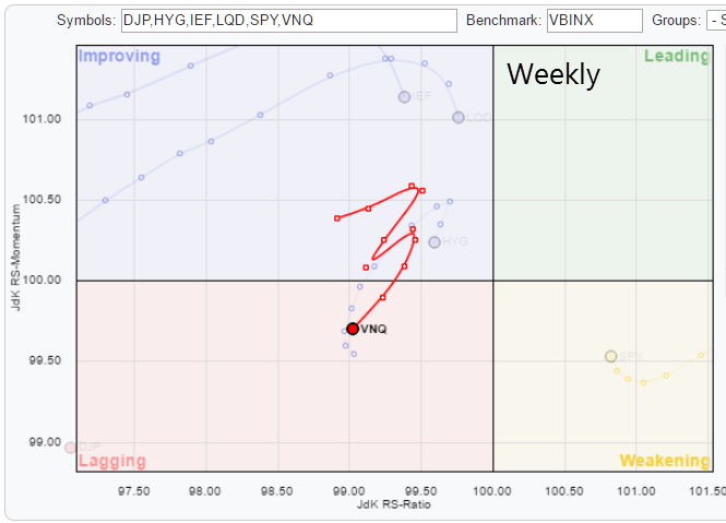
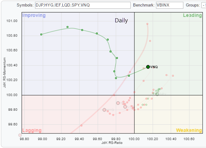
On the weekly RRG, VNQ shows a strange zig-zag and has just rotated back into the lagging quadrant from improving and is heading further into it. On the daily RRG, the rotation of VNQ over the past ten trading days led through the improving quadrant and seemed to follow the expected rotational path before snapping to the right pretty abruptly two days ago.
It is not uncommon for rotations on the weekly and daily RRGs to show different paths. There is a ChartSchool article on this matter here.
However, the combination of the zig-zag move and the trail heading straight South-West on the weekly and pointing East (and only slightly North) on the daily captures my interest.
VNQ - Weekly chart
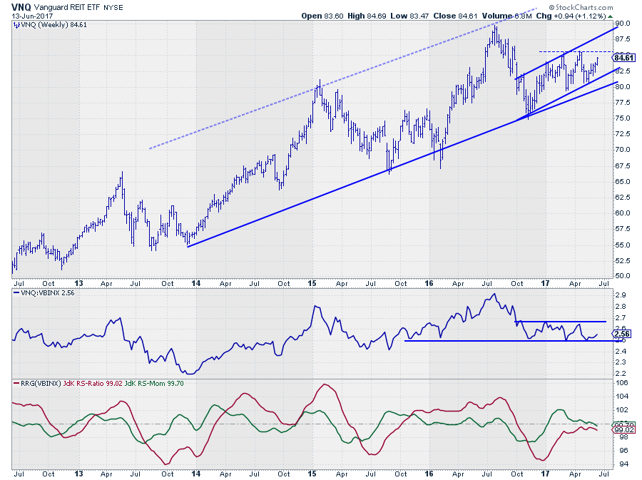
This weekly chart of VNQ shows that Real-Estate is still moving within the boundaries of a rising trend contained in a broad channel since 2013. The RS-Line of VNQ against VBINX had trouble to follow the market higher and ended up in a sideways range that started in Q4-2016.
This sideways move in Relative Strength caused the RRG-Lines to move close(r) to the 100-level and stay there. Over the past few weeks, the JdK RS-Momentum line started to drop again and is now falling below 100. The JdK RS-Ratio Line looks to be rolling over without crossing above 100. This is causing the trail on the weekly RRG to turn back into lagging.
The problem is that the last leg of the RS-Line is pointing higher wich will stop or pause the decline in the RRG-Lines, bringing them even closer to 100 and therefore harder to read as it indicates a performance in line with that benchmark without a pronounced trend in either direction.
VNQ's relative strength against VBINX needs to break below that horizontal support level and accelerate lower to provide meaningful fuel for a strong (negative) rotation on the RRG.
VNQ - Daily Chart
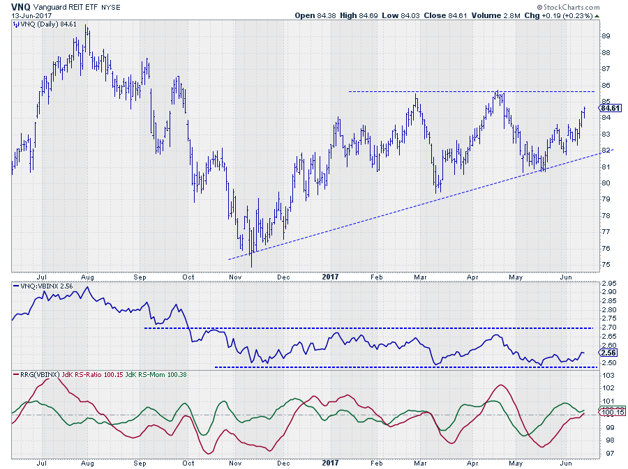 The daily chart of VNQ adds to the picture described, and shown, above with regard to the weekly. The sideways range in relative strength is clearly visible in the middle pane. The recent move higher off of the lower boundary of the range suggests that a new leg towards the upper part of the range has started.
The RRG-Lines are confirming that idea as RS-Ratio has just followed RS-Momentum higher above the 100-mark. Given the magnitude of the swings of the RS-Ratio line over the past years, we can expect more upside in coming weeks.
Also in the daily price chart, there is some upside potential left before VNQ hits resistance.
All in all, we have two forces pulling in opposite directions for VNQ which makes it a hard call.
The weekly rotation is still suggesting a continuation of the underperformance while the daily rotation is showing improvement. As VNQ is close to the benchmark on both RRGs, which indicates a lack of a stronger and thus prevailing trend, I would remain cautious with positions on either side.
The short-term seems to be offering the potential for a "trade" but watch closely!
Equities / Bonds rotation (SPY?IEF)
 With SPY on the right-hand side of the RRG and IEF (and other bonds related asset classes) on the left-hand side on both the weekly and the daily versions, the relationship is clear. Equities are to be preferred over bonds!
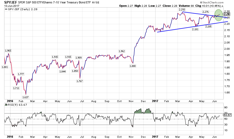
This rotational pattern on the RRGs is supported (no surprise) by the pattern that is unfolding in the direct SPY: IEF relationship on a regular chart.
Above is the daily chart for SPY: IEF in combination with an RSI (9 days). Where this RS-Line had been in a consolidation since March, it is now breaking out of that consolidation to the upside which suggests a continuation of the previous trend, which started at the break above horizontal resistance back in November last year.
It looks like Equities are in for another relative move higher when compared to bonds.
Julius de Kempenaer | RRG Research
RRG, Relative Rotation Graphs, JdK RS-Ratio, and JdK RS-Momentum are registered TradeMarks by RRG Research
Follow RRG Research on social media:
If you want to discuss RRG with me on SCAN, please use my handle Julius_RRG so that I will get a notification