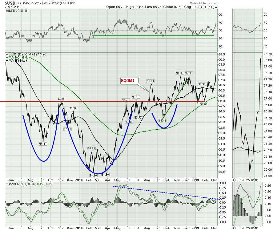
Currency charts are just one type of asset class. They can play a pivotal role in many, many industry groups; they can affect the bond markets, the commodity markets and the equity markets in a single move. Over the last six months, the trend on the US Dollar has been sideways within a narrow 2-3 cent range. This week, we got some clues that this might be changing. As I write this note at 2:50 ET, the USD is pulling back at the top of the range at 97.30. This chart will update end of day. Line charts only show the close, ignoring the intraday highs and lows. The PPO trend line in the bottom panel suggests that a breakout would be a significant change in momentum, breaking a nine-month down trend.
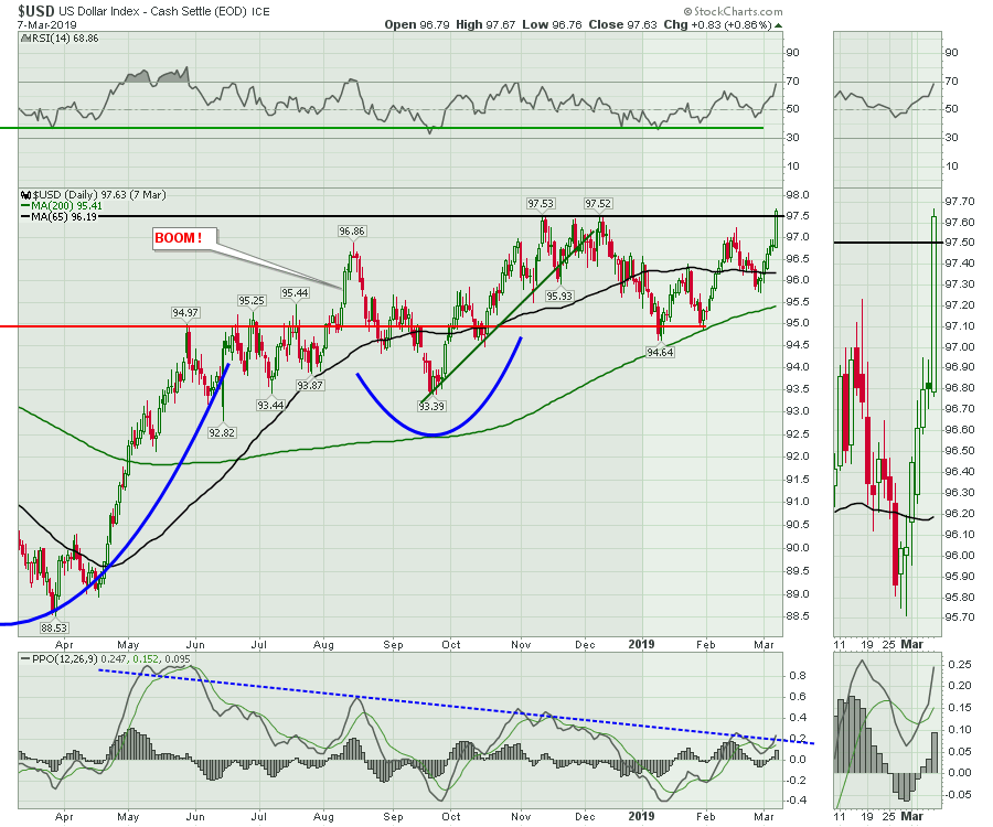
 Showing the $USD with candlesticks paints a picture of where the intraday highs are. This chart is zoomed in on the past year. Notice the black line at 97.5 - more on that later.
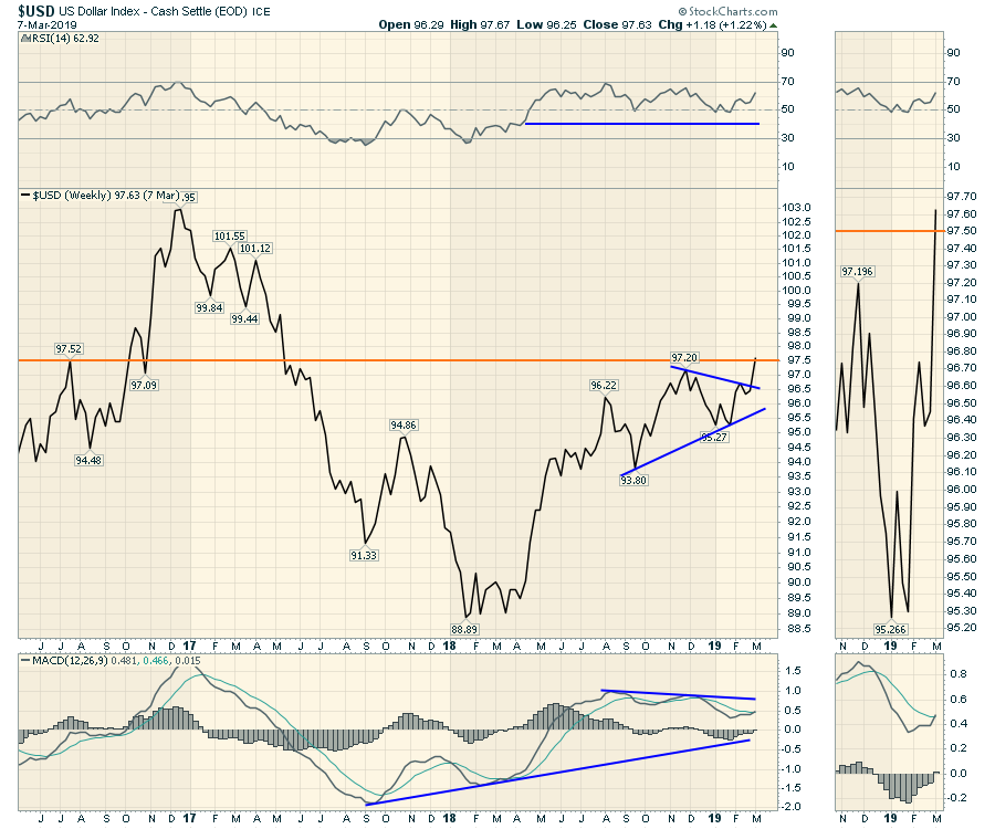
 Using a weekly line chart, a close at 97.36 would not show the intra-week position on Thursday. A Friday close above 97.20 would be a very significant development.
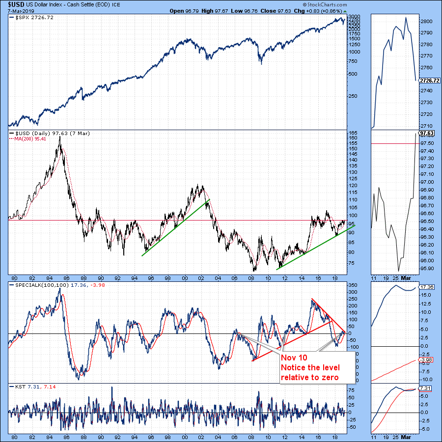
 Below is a long term chart of the $USD, with an important level drawn in at 97.5. Notice that the market stalled in 2014-2016 after moving above that level. The 1998-2002 period was filled with extreme volatility, from the Asian Financial crisis to the collapse of the dot coms. In 1980, the Fed was trying to conquer inflation, which led to dramatic changes in the bond, currency and equity markets. We can discuss a lot about each peak or major turning point in the currency as well. For today, the main point I want to make is that, when the US dollar has moved above 97.5, assets have been affected by volatility.
 One day does not make a major change in trend. However, if, a month from now, the US dollar continues on its path higher, I would not be comfortable thinking it's still business as usual. Don't Ignore This Chart!
Friday's Market Buzz was all about the $USD. Click to watch here.
 Wednesday's Market Buzz talked about the Railway stocks and the fragility of their momentum rolling into March. Click on the Market Buzz below to watch.
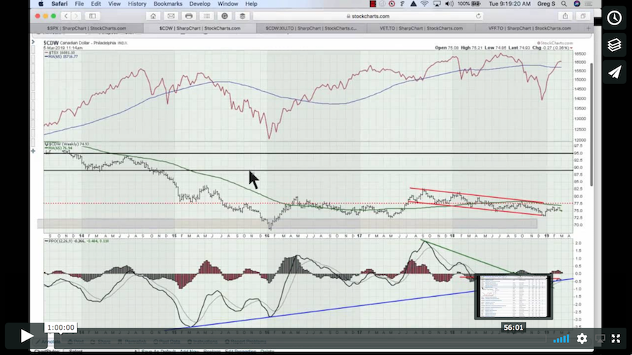
 Here is the Canadian Market Roundup for the start of March. In this video, I also set up a scan to find all the stocks that made a new 1-year high. There are some great charts out there!
 Below is some information on other videos produced this week.
Here is a link to this week's Weekly Market Roundup video, with a lot more information on the asset classes.

If you would like to learn more about the basics of charting, check out Stock Charts for Dummies. The first section of the book walks through all the chart settings you need to help you get the charts you want, the second section explores why you might use charts for investing and the third section is about putting it all together.
Click here to buy your copy of Stock Charts For Dummies today!
If you are missing intermarket signals in the market, follow me on Twitter and check out my Vimeo Channel. Bookmark it for easy access!
Good trading,
Greg Schnell, CMT, MFTA
Senior Technical Analyst, StockCharts.com
Author, Stock Charts for Dummies
Hey, have you followed Greg on Twitter? Click the bird in the box below!
Want to read more from Greg? Be sure to follow his StockCharts blog:
The Canadian Technician