 The is the third article on Pair Analysis. Here I will show the results for several different pair combinations with reduced commentary. If you have not read the previous two articles on Pair Analysis, I strongly suggest you do so before continuing with this one.
Recall, the pair analysis is accomplished on weekly data. Think of the ratio line like this: when it is moving upward it means the numerator is outperforming the denominator. When the Rate of Change (ROC) goes below the -4% line, it means the numerator is no longer outperforming the denominator. Hence, you want to rotate into the denominator; or sell the numerator and buy the denominator. Complementarily, when the ROC goes above the +4% line it means the numerator is now outperforming the denominator, so you want to sell the denominator and buy the numerator. Also, the signals are at the crossing of the + and – 4% lines, not at the peaks and troughs of the ROC. All charts and data use a 2-period simple moving average of the ratio line unless stated otherwise. The Core for all of these charts is the S&P 500 Index.
Pay attention to the gray/white background shading as it will help you get a feel for the amount of trading involved (gray shows when invested in the numerator). When testing models/systems the use of in-sample and out-of-sample data tends to make the results more robust. The first article on Pair Analysis used data from 1998 through 2012 as that was the last time I had updated the data. Pair Analysis – 2 brought that data up to the end of 2018.
Chart A is Large Cap Growth (IVW) and 30-Yr. Treasury (TLT).
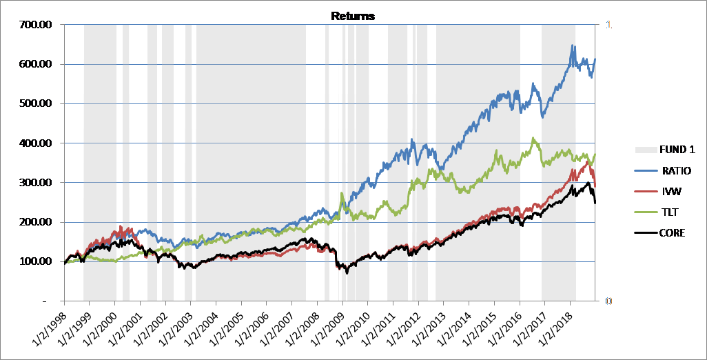 Chart A
Chart B is Small Cap Blend (IJR) and Aggregate Bond (AGG).
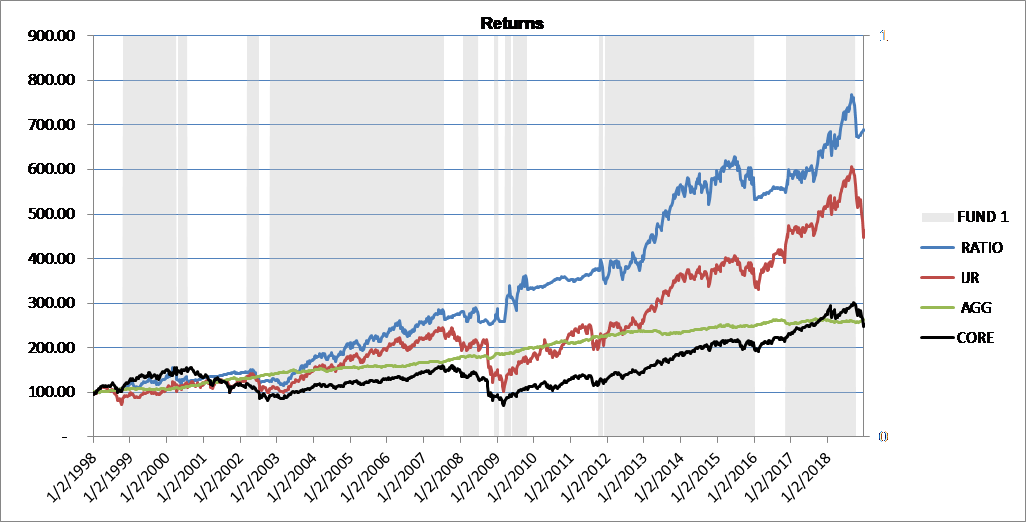 Chart B
Chart C is Large Cap Blend (SPY) and Commodity (GSG). Recall that the Core is the S&P 500, which is why SPY and the Core are the same line.
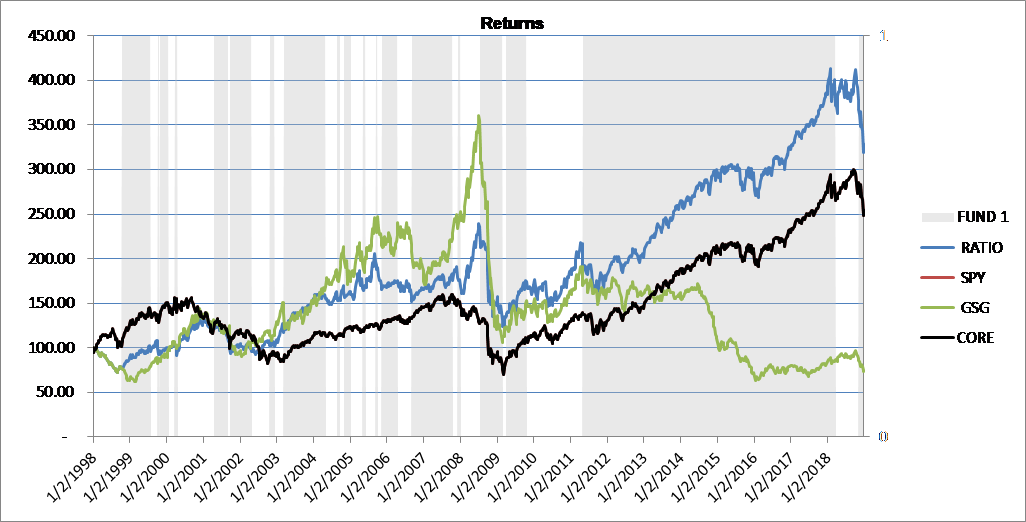 Chart C
Chart D is Financials (XLF) and Gold (GLD).
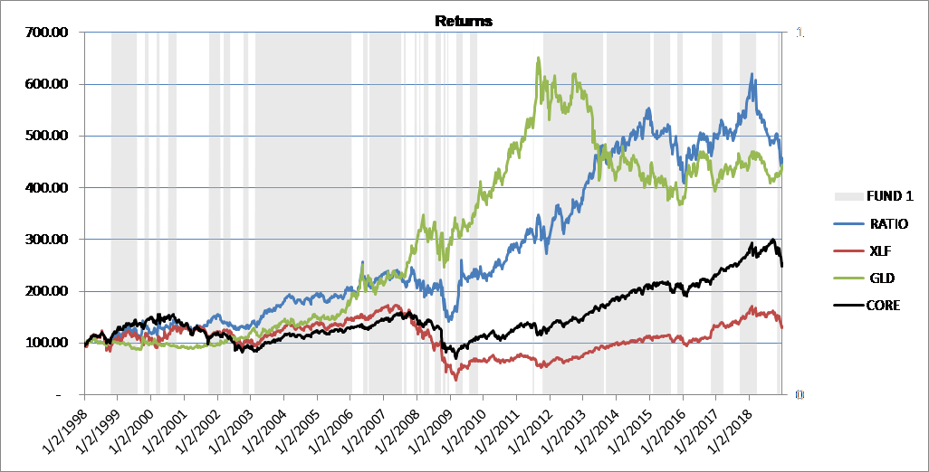 Chart D
Chart E is Consumer Discretionary (cyclicals) (XLY) and Consumer Staples (XLP). Cyclicals are usually good performers in bullish environments, and I think that is obvious from the chart.
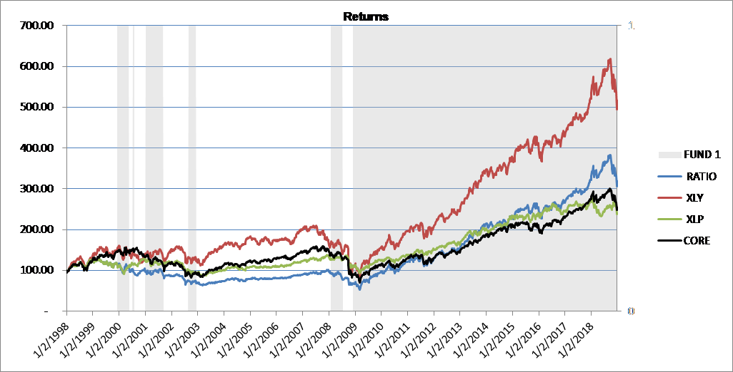 Chart E
As promised Chart F is the familiar IJR:IEF pair using the raw ratio without the 2-period smoothing. There were 92 trades in this pair combination which was 4.38 per year. The same pair with the 2-period smoothing had only 26 trades or 1.24 per year. Performance of the two was similar. Factor in trading costs, slippage, etc. and the difference is significant. Do you think the 2-period smoothing works! Note: Trades for the pairs is a little different than buying and selling stock because here when you sell one you buy the other.
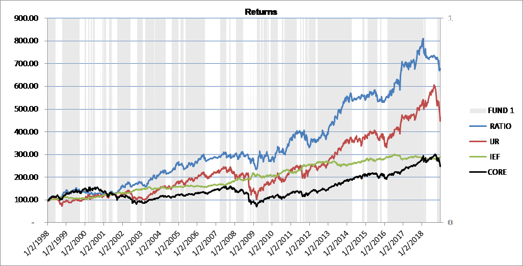 Chart F
These articles on Pair Analysis and Core Rotation Strategy have generated a lot of comments. I try to answer them all, but keep in mind, the comment section closes 6 days after the article is published. Not only can you not make a comment after that time, I cannot respond to any. This means if you make a comment on the 5th day, I may not be able to respond. Also, please keep the comments tied to the current article. And finally, the last article on Pair Analysis (#4) will show you the top 50 pairs based upon performance and also show you the bottom 50 pairs out of over 700 pairs tested. Thanks.
Dance with the Trend,
Greg Morris