Hindsight is a beautiful thing when asking where to draw a trend line. It’s always obvious after. It is not obvious as the market evolves. For the GDX:GLD ratio, it started to create a little hook on top this week. I have a trend line on GDX:GLD ALWAYS. However, sometimes the ratio pulls back, then surges to higher ground. Almost every time, before the final roll over, it makes a pullback, then goes on another run. The word that makes that sentence hard is the word 'almost’. On the chart below, notice how many little pullbacks the ratio in the top panel had from February to August 2016. Also notice how if (I did not draw a trend line there so we could talk about it) we drew one trend line off the absolute bottom in mid January 2016, there were many sell signals as the ratio broke the trend line connecting lows. If we connected January with the March low, we would have sold in May. If we used the May low with the January low, we would have sold in July.
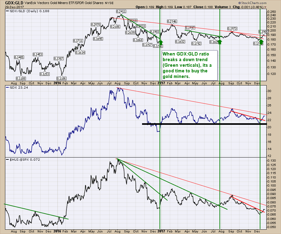
In hindsight, we can see the ratio surging for 6 months and the best trend line did not use the bottom in January 2016. The points from March, May and July were ultimately the best ones. However, that three point (March, May,July) trend line break in August coincides with simultaneous peaks in both GDX and the Gold bugs compared to $SPX ($HUI:$SPX) ratio. However, the GDX panel and the $HUI:$SPX ratio would use different lows for their respective trend lines. Neither would use the January low! Crazy.
Lastly, notice the final spike low in mid-January 2016 on all three panels would have scared most investors out of the trade just before it went on a rocket move. Its never easy! Particularly important is the break in GDX, below previous support, only to turn and reverse higher. It is important to remember that almost all commodities bottomed then.
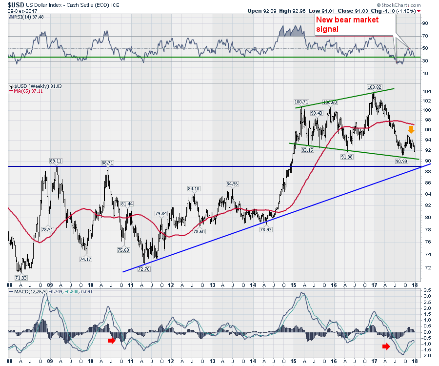
One more thing, that January 2016 low in GDX happened just before the breakdown in the $USD started in February 2016. You'll see that on the $USD chart farther down.
Going to the far right-hand side of the chart above, we currently have three panels all confirming the three month trend line break in red.
Here is the current cautionary condition. We are right at the long 18-month red trend line I have drawn on the top panel. Notice that trend line does not use the August 2016 peak. Both GDX and $HUI:$SPX red trend lines do use the August 2016 peak. Those two trend lines are very important. The big money was made in 2016, when all three of these trend lines were broken. One of the small concerns I have, is during that rally in 2016, it was a very smooth push on all three charts through where the 2014-2016 trend lines would be broken. Not shown, but you can see the smooth vertical ascent on all three panels.
So the GDX:GLD ratio is at resistance. The other two are not on this close up view. The tough work begins this week, seeing if we can get this $HUI:$SPX ratio to fly through the big down sloping trend line. Breaking a trend line against the $SPX is when the real money is made. I have profits in some of the gold miners since mid December. That gives me a little cushion to let the trade work, but I don't want to give those profits away either.
Four things we want to see in the next week or two.
1) The $USD weekly breaks down below support at 90.99. Also the key level of 89 is going to be important.
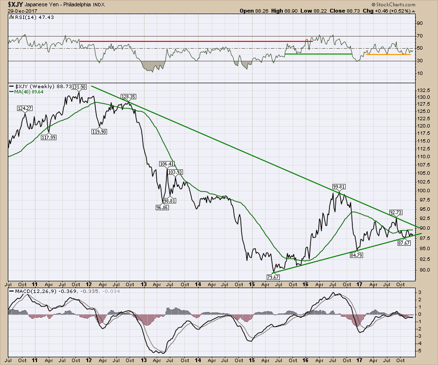
2) The $XJY weekly breaks out above resistance. 90 is the area of concern.
 3) The $HUI:$SPX breaks through the 18-month trend line.
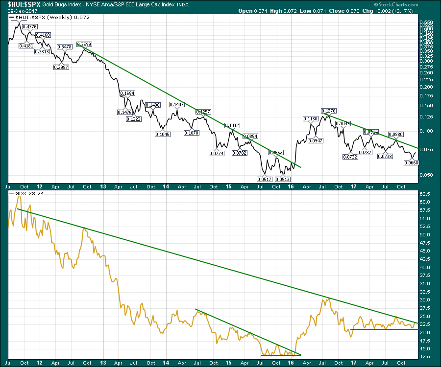 4) GDX breaks the green 6-year down trend which is also the 18-month trend line. Shown above.
Needless to say, this is where the hard work begins. HODL is an acronym on Twitter. Well it looks like a misspelt HOLD, it is referring to Hang On for Dear Life!
There is a wealth of information about the commodities setup for 2018 on the recent Commodities Countdown video 2017-12-28, including this gold trade.
Commodities Countdown Recording With Greg Schnell 2017-12-28 from StockCharts.com on Vimeo.
Good trading,
Greg Schnell, CMT, MFTA