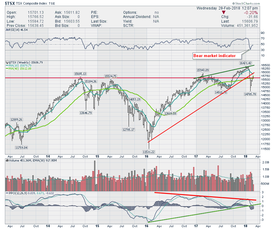
Canada has not been in the big bull market the USA had going earlier this year. After a big pullback in the USA and Canada, we are watching the height of the bounce to see if Canada can get back into the bullish camp.
Currently the $TSX has bounced up and stalled at the area of resistance that has been in place for four years. However, there are broader concerns. The RSI indicator shown in the top panel bounced down to 30. A bear market indication occurs when the weekly RSI gets down to 30.
 Canadian breadth is poor but above dismal. Breadth is defined as the number of stocks participating in upside trends. There are multiple ways to calculate breadth
- Bullish Percent Indexes
- Advancers / Decliners
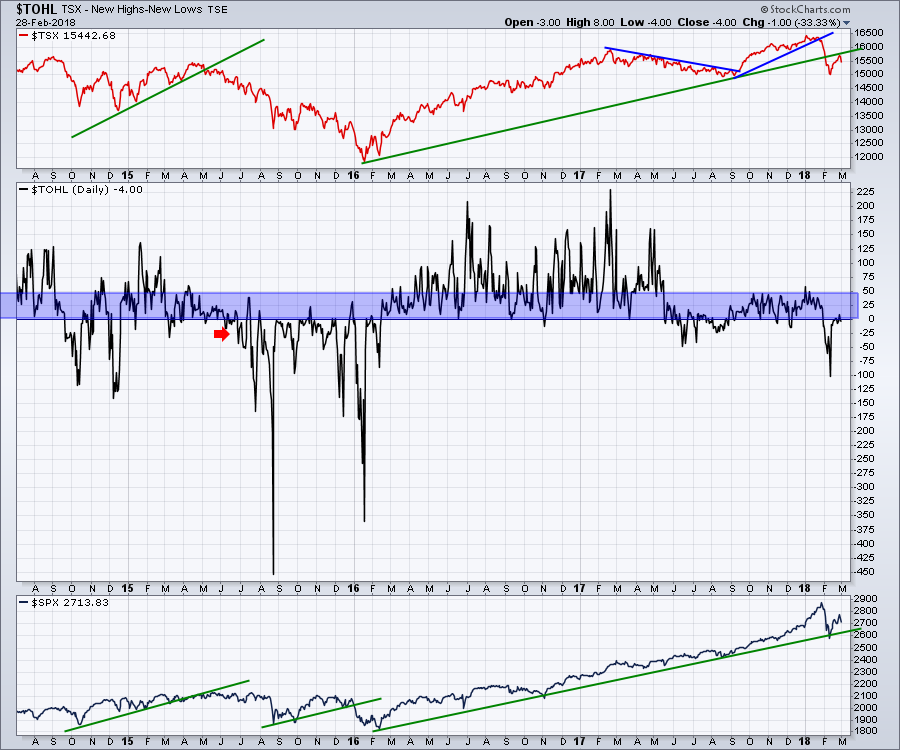
- Net New Highs
- Percentage of stocks above the 200 Day moving average
- Percentage of stocks above the 50 day moving average
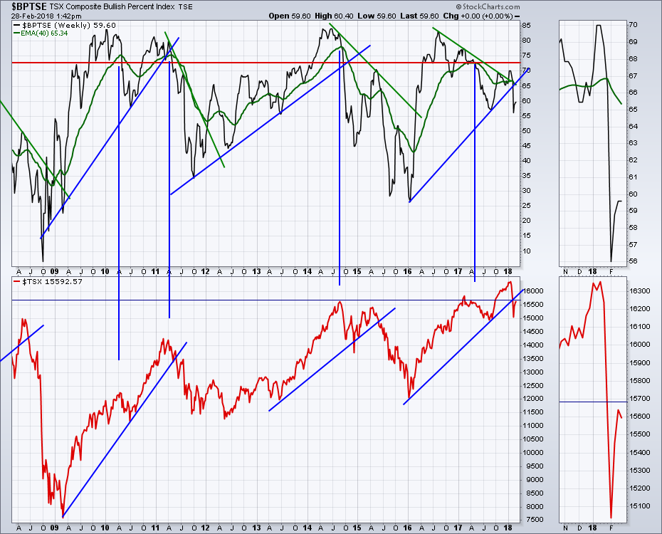
Bullish Percent Indexes use stocks on buy signals. When we have an individual stock on a buy signal, the price has recently made a higher high (not necessarily an all time high). A Bullish Percent Index takes a given group of stocks ( in this case, $TSX listed stocks) and calculates the percent of the total that are on buy signals. Obviously, if everything is on a sell signal, that is a clear problem. While it does not usually reach the extremes of 80% or above, it does not usually reach the depths of low 20's or below. just because the price is not making a new high right now does not mean it's on a sell signal. There can be a large distance in price between the last buy signal and the last low. This calculation is also covered in the book Stock Charts For Dummies.
What we see on the chart is that the % of stocks on buy signals has been declining on every peak. While that in itself is not a problem as long as 2/3 of the stocks are participating, an uptrend line connecting the lows has been broken. Historically, that has been meaningful. As well, the zoom box show the green 40 week moving average and the $BPTSE is below that. That has also been a signal for weakness.
 Looking at the Net new highs which is the same as taking the number of new highs minus the number of new lows, We can see that it is having trouble getting above 50. 50 is a level that I have noticed is too weak for the market to make meaningful new highs. We need much higher participation usually. When it is coming off extreme lows it can be a buy signal, but usually you need a lot more new highs than new lows to carry the market higher. The chart below shows recently we have just as many new 52 lows as 52 week highs. This is not bullish enough. While investors can choose to buy the stocks moving higher, the overall Canadian market is too weak to make progress as a group.
 Staying with the chart above, we can see the $TSX has taken out the highs of 2014 but is now back below that level. Notice on the $SPX in the lower panel, the market is 30% above the 2014 highs.
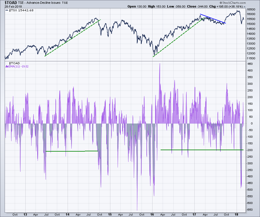
Next chart is the Advance / Decline information ($TOAD). This is done on a daily basis and keeps track of all the up stocks minus all the down stocks. If more stocks are moving higher than lower, thats probably the direction of the market. However, this information is very choppy. To get around this choppiness, I group a few days (8) together and use an average.
Notice the areas where the two green horizontal lines on the chart are. These are the typical low average levels of the advance/decline (a/d) information. In February 2018, our advance decline information looks more like a level that is associated with long periods of weakness, not just short term weakness. If you use the 2012-2013 periods, the market was choppy with no real progress. If you use the 2014-2016 period, the market was in an outright decline.
 All of these factors combine to make the current setup much more of a trend change from an up trend to flat/sideways chop or something more damaging to the portfolio.
I explain a lot more about these changing data points in The Canadian Technician Video below.
Canada Bounces 2018-02-27 Video from StockCharts.com on Vimeo.
While I sound negative and that may differ from the view you have, the data shown above points to some significant weakness that should at least be recognized. You don't have to agree that the potential for a bear market is upon us, but it is worth being aware of the setup for a larger slide to take place. I have been discussing the Canadian market weakness since mid January. The indicators (Price, RSI, Bullish Percent, Net New Highs, Advance/Decline and the Percentage of stocks above the 50 DMA and the 200 DMA on the video) all corroborate the likelihood of this being more than just a weak couple of months.
Good trading,
Greg Schnell, CMT, MFTA